Sri Krishna Pharma : New Creative Work Already Bearing Fruit
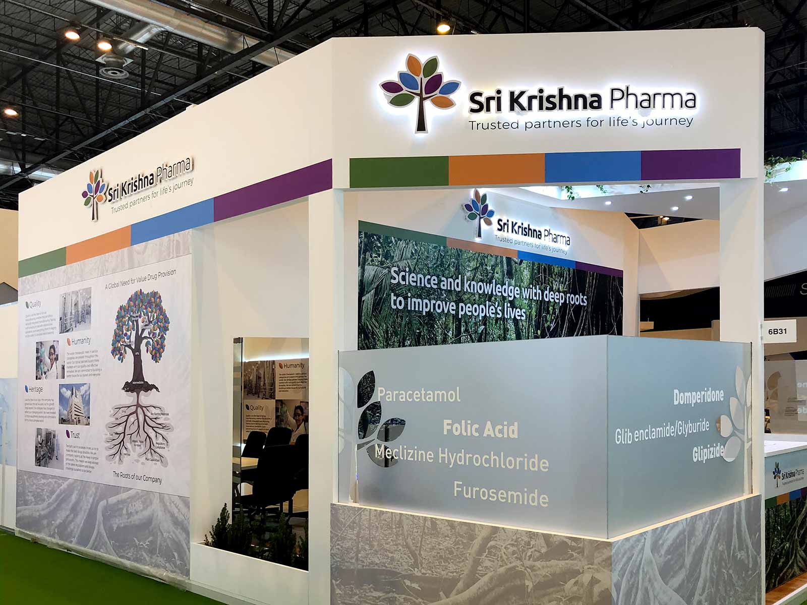
We are delighted to showcase the rebranding, and ongoing marketing, we have recently done for one of the oldest and most prestigious brands in the Indian pharma space – Sri Krishna Pharmaceuticals.
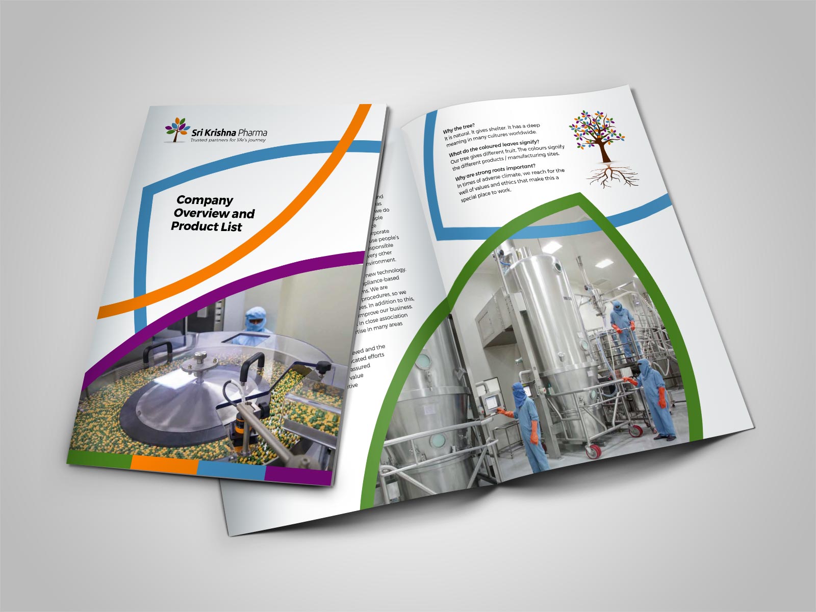
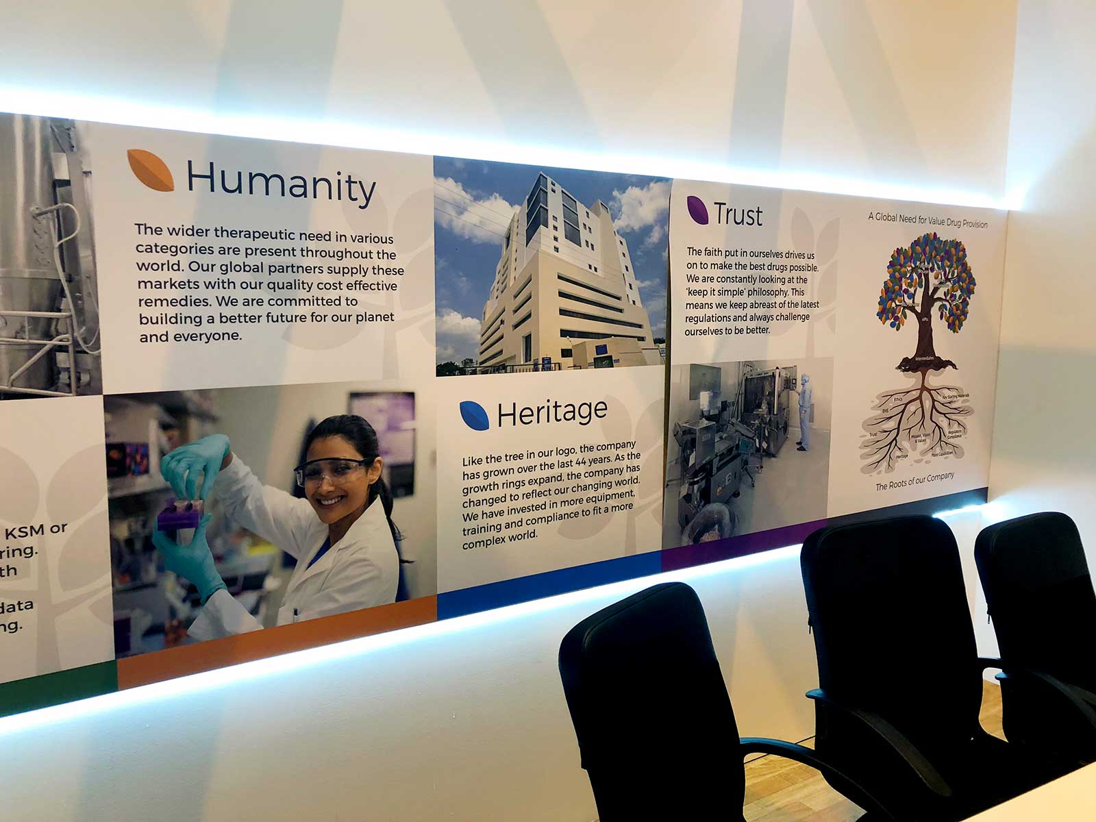
It is with no small responsibility that such undertakings are made, and, unlike many pure design houses, we remain focused on what happens with the brand afterwards. It’s alright having a new logo but how does one bring it to life and make it live? The ‘living part’ is about communication, internally and externally.
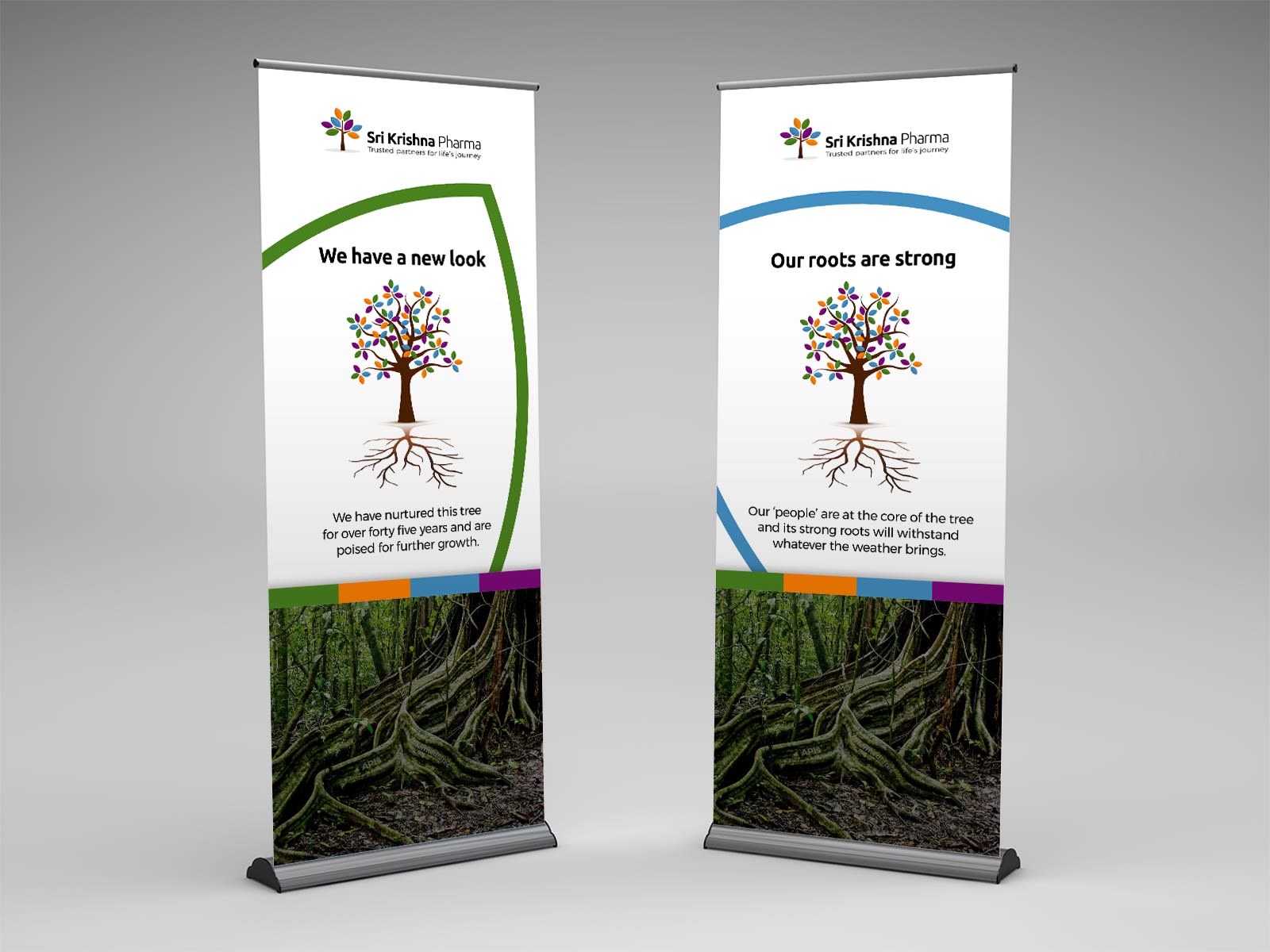
The coloured leaves on the Sri Krishna tree can be interpreted as fruit and these signify the many different products the company produces. The tree also has roots, and these give the company strength in everything it does.
It was also clear to senior management that the website needed a thorough rethink. Like anything outward facing, and any concept, it needs to have plenty of room to grow and can be tweaked as various things come to light. With our help, Sri Krishna’s tree will continue to resolutely grow.
Sri Krishna Pharma website: www.srikrishnapharma.com